Curb had an MVP concept designed that they were not satisfied with. When I checked the design concept, I offered to do a UX analysis and maybe work with Curb on UX fixes or a redesign.
By understanding Curb's vision for the app and their concerns with the concept at hand, I decided to work on a redesign of their designed concept. Here, I will list the new concept I created and will try to compare it to the old version whenever possible.
I joined Curb while app development was in process. The engineers were already working on the infrastructure and the main process of the old version of the app. The team leader wanted to have an MVP up and running in less than three months. So, there was no time to recruit users for user testing or do user research.
To overcome this I did a few things that helped me design an experience that Curb's users loved.
Curb's users used to order from other third-party apps like Wolt, what would make them stick to Curb's up is a strong brand voice and a personalized user experience that they cannot match on other platforms.
So, for customers who love Cub, I wanted to show a Curb voice. There was a brand guideline book already available that I used to build the opening experience.
🧠
I used the app loading time to introduce the first-time app user to Curb's brand values and tone, helping them transition from their daily tasks to the Curb world. Giving app users a unique Curb experience will help build loyalty to the brand, putting in mind that most users will already be Curb lovers, this will help increase customer retention rate.
I also imitated a real-world restaurant experience. You won't go through the door and get tossed a menu in your face to choose what you want. Instead, you want to feel welcomed. This is the whole point of slow entry to the app for our first-time users.
Reference1: Stop Using A Loading Spinner, There’s Something Better
This loading experience is for first-time app users only, returning users will not that loading screen instead we change our focus on getting the user into the app ASAP to reach their lovely menu and order what they want.
Ordering food through apps or websites usually triggers decisions that are related to three stages.
Each stage triggers different parts of our brains and has a different motivation. To create a seamless ordering experience, I had to clean the process to go through each stage gradually.
This is the old ordering userflow

Different colors represent different stages. The old userflow was not consistent and kept going back and forth in tasks between ordering, exploring, and creating an account.
To clear this, I redesigned the process of ordering a meal to look like this:

In the new userflow, the user goes through each stage gradually, from exploring the brands and meals available to choosing to order to finally creating the account on the app.
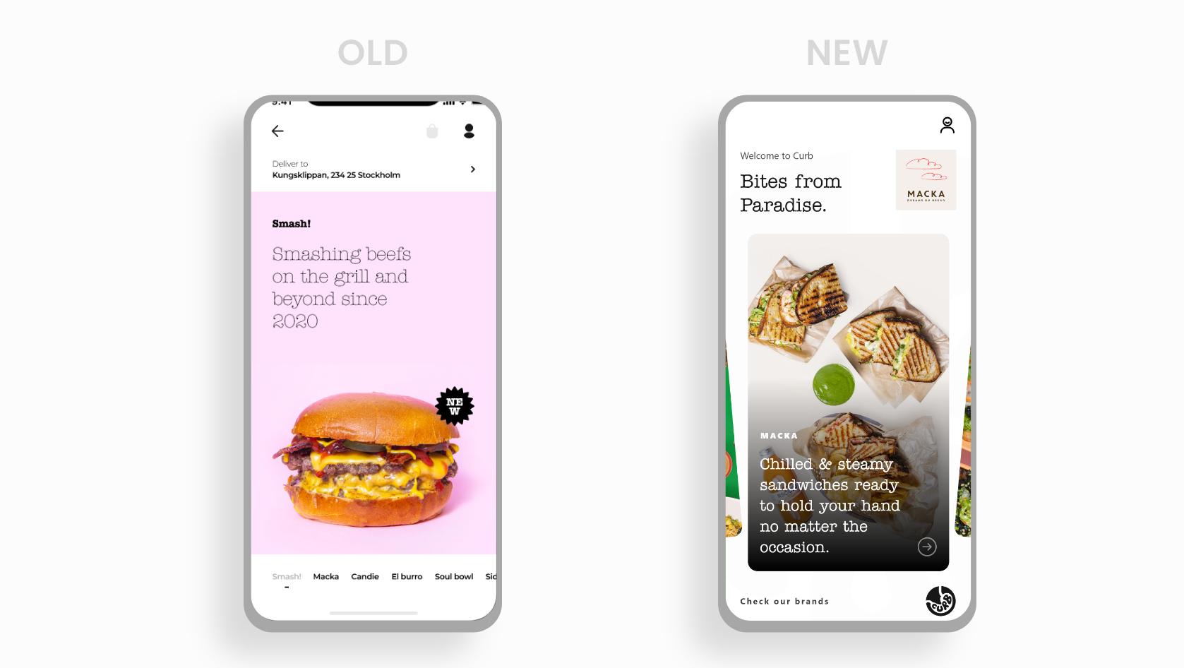
In the old version, brands were not presented in a way that cultivates brand loyalty and shows the brand voice.
In the old version, brands were not presented in a way that cultivates brand loyalty and shows the brand voice.
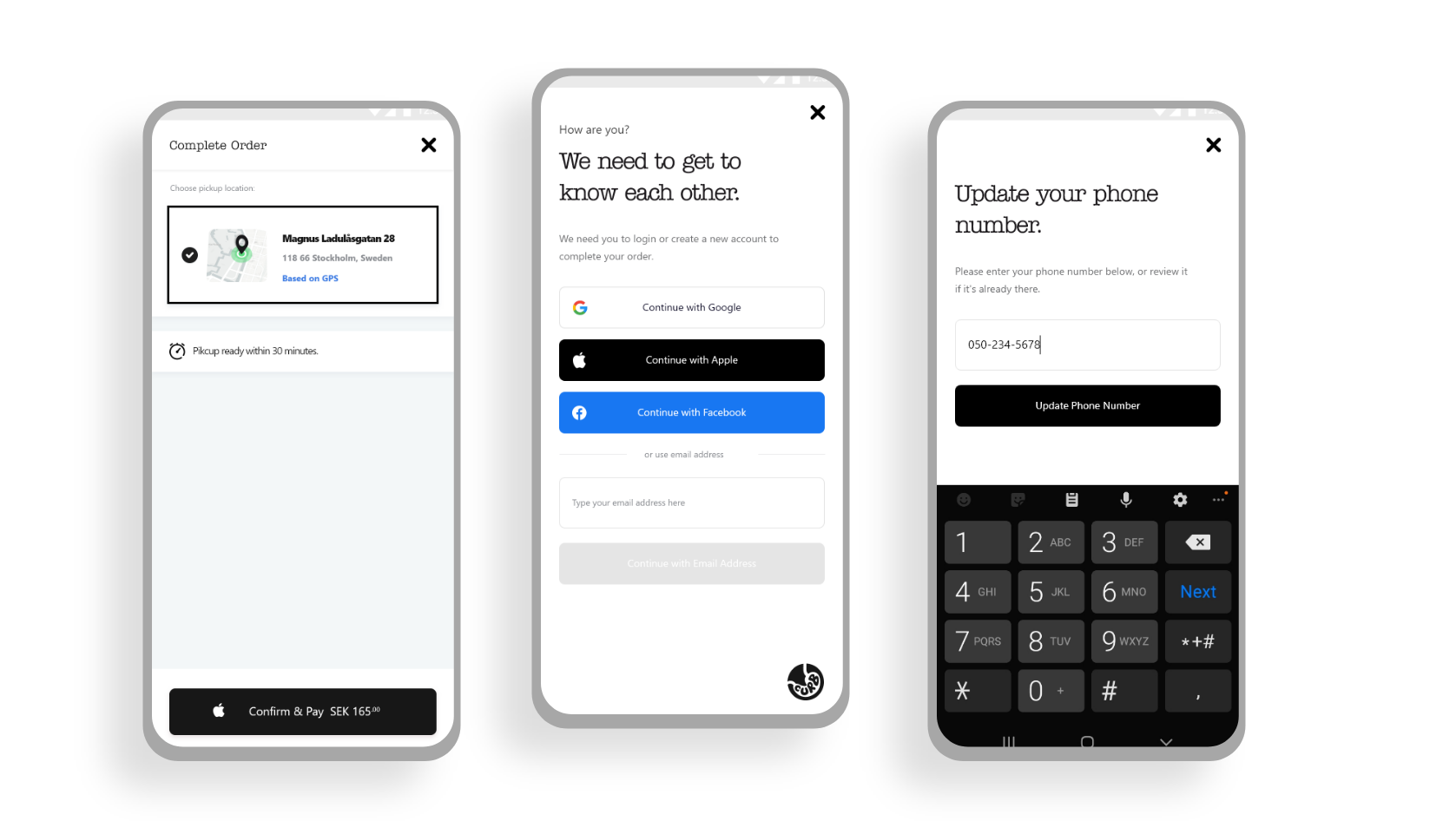
Interrupting a user's task is the worst thing we could do as user experience designers. When users are opening an app to order food and are asked to log in or create an account first, it sucks. So, in the new design, you get food once you open the app.
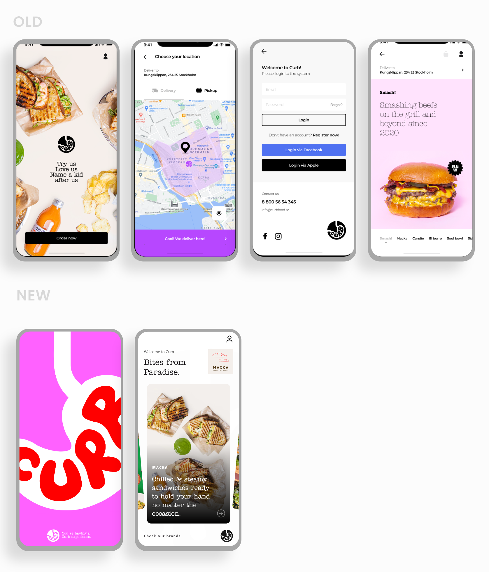
In the new version, once the splash screen loads, the user is presented with brands directly.
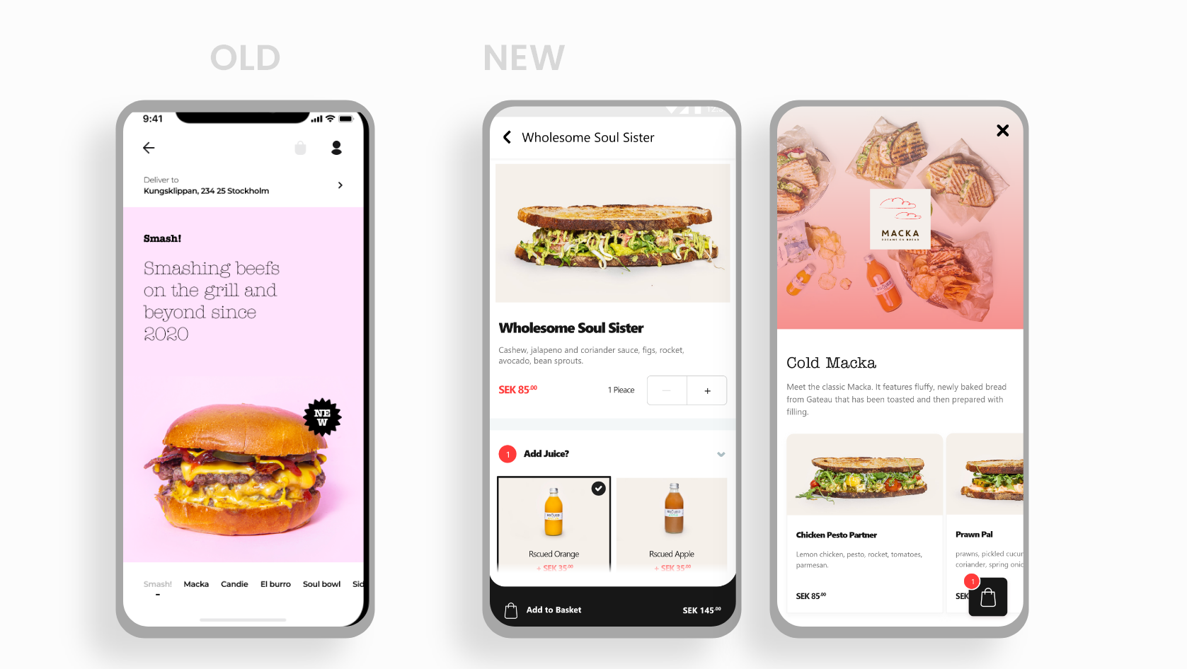
In the new design, the add to basket button was floated. This allowed the user to start the order at any time fast, unlike the old concept where users had to scroll down the whole page.
Also, after adding a meal to the basket, the basket icon floats on the app with the number of meals added to it in the right bottom corner of the screen, allowing for easy access and a quick find.
The brand tone was very important for the marketing team to build customer loyalty. I customized pages and empty states to vocalize our brand and create our own language and tone.
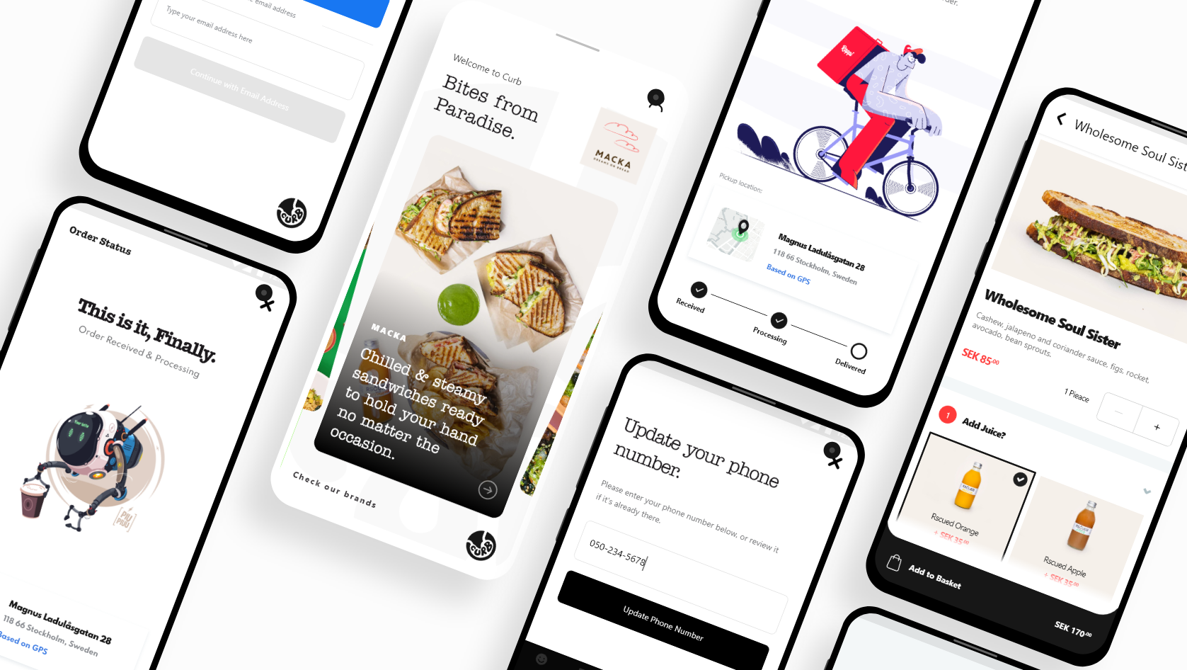
Curb users were used to food delivery app tracking systems. While Cub promised a fast way to get your food, the app lacked communication on this part. We had an amazing opportunity to track the status of the food with our own kitchen management system, so I decided to add these features to the MVP.
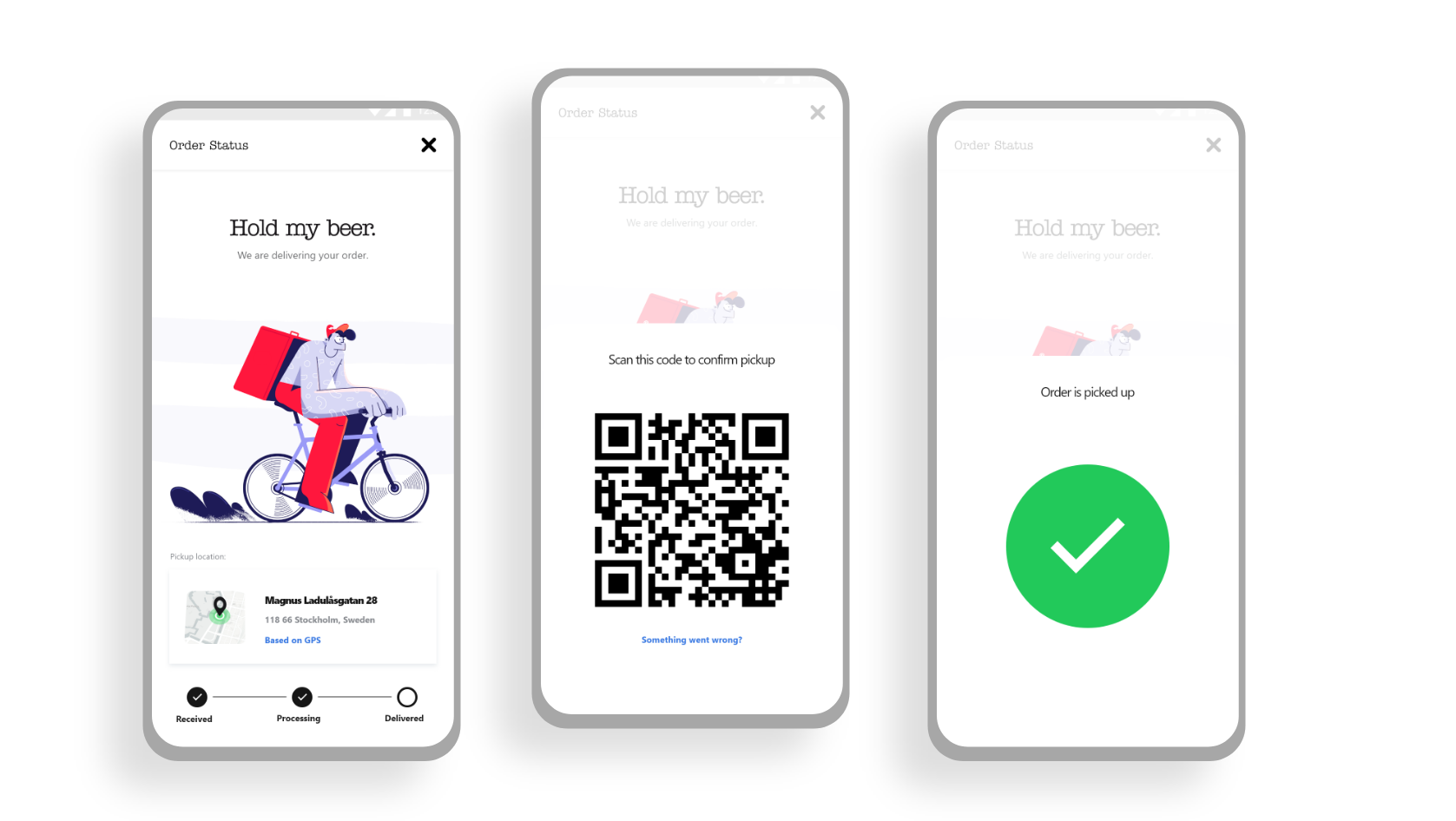
Users can track the status of the order, and once the order has been delivered the QR code shows up on their phone for the delivery guy to scan it to confirm final delivery on Curb's system.
On Curb's food app, the user is not asked to create an account unless they are in the final payment step. This allowed us to present a pure food ordering experience to our targeted users.
I was contracted to work with Curb for two months to design this app. While they all loved the app and I received positive feedback on my work, the final decision from the CEO was to not offer me a full-time job. When I reflected on what happened, I learned a few lessons that I am sharing with you here.
While I didn't get to work on the next phases of the app, I would like to share my vision here. Since the current MVP was mainly targeting onboarding first-time users of the app.