PaySupp was offering a supply chain finance service to SMEs in Egypt, and as time passed, the vision of the startup shifted towards expanding to a multi-financial products provider, which then expanded to a financial market network, serving different users with different needs through different portals.
The onboarding process in PaySupp was very limited when it came to onboarding different customers on different financial products, and there was a clear need to redesign a new onboarding process. A new process that enables easy onboarding for different users with easy access to multiple financial products, while at the same time paves the way to easy expansion in the future to add more portals and/or financial products.
It was clear to me that the current design of the onboarding process didn’t put the user in mind; no user testing was performed, no interviews with users were conducted and the whole process was designed to serve only the current business need; which is to collect specific details and documents to offer the financial solution.
Here is how the old onboarding process was:
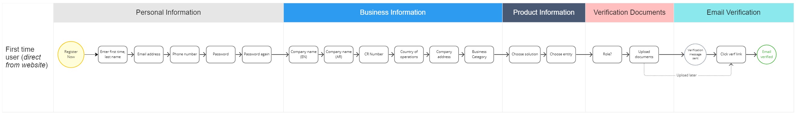
The main issues we were facing with this onboarding process are:
I was leading the redesign of the onboarding process, which was a part of a bigger redesign of the whole platform to meet our new business mission and vision (turning into a financial market network).
For this case study, I am only talking about the onboarding process, part of the platform transformation.
Even though the issues with the onboarding process were clear, I still was expecting more information, feedback and issues to be raised once I talk to users and conduct some testing with them on the current onboarding process.
In my research efforts, I looked at other competitors in the market and other fintech companies around the world offering the same or similar services. I analysed their onboarding flow, to get some ideas and insights, and looked into other case studies published online from other designers.
I also moderated multiple online user testing sessions, where we would have customers onboard the system while we monitor and see the issues they are facing. The sessions were recorded, along with notes and feedback logging to use further in our research.
Part of our user research for the redesigning of the whole financial process were contextual interviews. I went back to our findings from these interviews and notes, to take any relevant notes into consideration when redesigning the onboarding process.
From the user research phase, I came to new findings that were not put into consideration when designing the first onboarding process.
Due to the nature of their roles. Our end users were easily distracted by unexpected calls, meetings, emails and other work stuff that kept their attention span short.
Our end users didn’t have one specific user designated for the system. Instead there were multiple people in the company (at least 2) responsible for managing the system. Sometimes with different roles in the company.
We noticed that some users will operate or handle multiple companies on the system due to financial reasons.
Now, let me show you what we got after our ux process and I will explain the story behind our decisions. I will try to compare between the old version and the new version of some screens.
Instead of onboarding users to solutions directly. We decided to separate the hierarchy to three levels: 'Customers, Companies, Solutions’. Solutions are assigned to companies, which are created and managed by customers. This separation allowed to:
Users should enter all the details required in the onboarding process including (personal, company, solution information and upload verification documents) to be able to start an account.
Many users didn’t complete the onboarding process for multiple reasons “as discovered from user research”
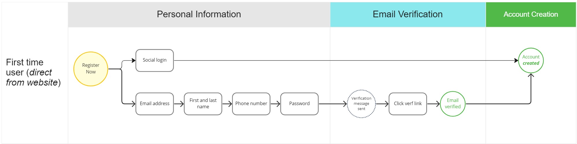
Create your account in one click. After changing the hierarchy, we decided to start an account for our users only based on their personal information.
New user flow looks like this:
This is the old design for the registration screen. The screen below was the first step in the old onboarding process (personal information), after completing all the information required in this page, the user will click Next to go to the next step and complete other information.
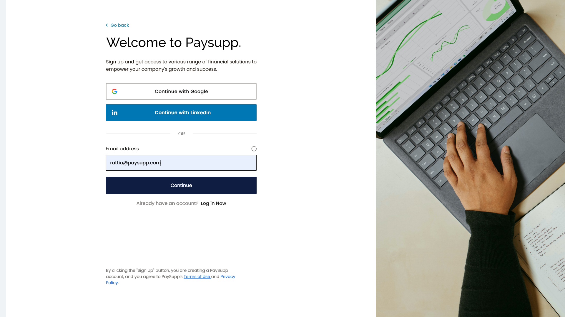
We redesigned the registration screen making it more simple and direct. On this step, the user can choose to register using social media accounts in one click, or use their email address and enter personal information in the next step.
In the new design, we took multiple points in consideration
Incase of registering using an email address, the required information is loaded in the next step.

After entering required details, a new account is created for the user and registration is complete (after verifying email address), or directly after signing up using social media.
We used to send an email verification URL to the registered email address. The user will then go to their inbox, open the message, click on the verification link, where they land on our website and verify their email address.
Looks easy, except when we did our user testing we found a couple issues here.
It goes like this. The end-user is signing up through their laptop, a verification link is sent to their email address where it pings on their phone. Users will then open the message on their phone, click on the link, and open the website on their mobile device. Since this is a new device, the user is required to login using their password to verify, which even if they did will not refresh the verification page on the laptop leaving the user stuck. This issue alone caused multiple phone calls and registration abandonment with multiple users.
Sometimes the verification email will not be promptly delivered to the user for any technical reason. There was no way for users to continue, except for exiting or waiting. Most users would leave the page open, and get distracted by other tasks and forget about the email. Some tried to sign up again, when they were stopped by an error that the email address is already registered in the database.
Since email verification was the last step in our old onboarding process. Users who entered a wrong email address, will not receive the verification link. Plus, there was nothing on the page that mentioned what email message was the link sent to, the design assumed that the user already knows. Even if the user realised that they entered a wrong email address, there was no way to fix it. Resulting in the user redoing the whole onboarding process, including typing all information and uploading all needed documents again. Which caused a hassle to the user and also to our resource consumption.
After testing multiple ideas for email verification, this was the best option.

After typing all information, a verification email is sent to the user with a verification code. The user here can access the mail from their mobile device and just type the verification code, or pass it through WhatsApp. Verification link was still available in the message for fast verification.
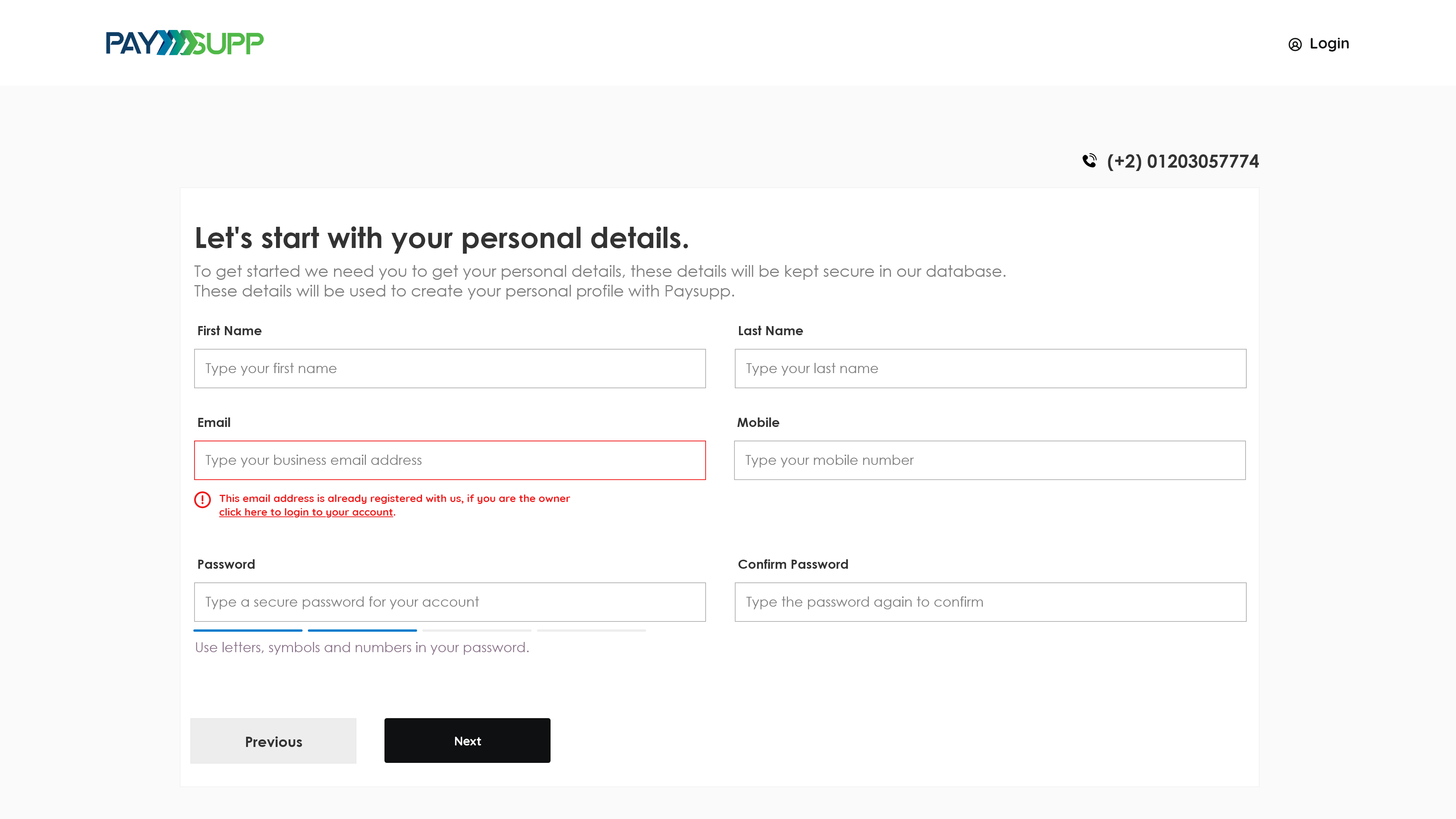
The user’s email address is shown and they can change their email address incase of typos, without having to go through the whole registration process again.
Incase of registering using an email address, the required information is loaded in the next step.
If for any reason, the user is unable to access their email address, or didn’t have time, or there was a delay in the email delivery, they can still choose to do it later without having to redo the registration process.
The email verification step happens directly while opening the account, which prevents any complications in the future after uploading documents and using our resources.
Now that our user has started an account, they still need to do a lot. They need to add their company information, choose their needed solution, go through the approval process and upload needed documents.
“ To maintain an easy onboarding process despite the amount of data required, we took into consideration a very important UX principle called Progressive Disclosure, which means in a nut-shell to defer advanced or rarely used features to later steps.
We wanted to guide our users to take it one step at a time, in an easy digestible way that makes sense to them.
Our old registration was long, and after adding multiple financial products to our platform and adding some additional requirements from financial regulators, we still needed alot of information and/or documents from our users, it was something we cannot avoid to offer our customers the solutions they need.
But we were still facing the problem of our users' short attention span as discussed in the research step. We needed to collect all the information required to offer the solution, yet don't impose with users' busy schedule and put in consideration the short attention span.
We fixed that here, with a multi-step welcome wizard that onboards the users and gives them the ability to stop at any moment and continue later without losing progress.

The wizard guides the user through a very direct step with a clear CTA button to what to do. User can take the action or close the screen and revisit your account later whenever they are ready.
The wizard consists of three main steps required to complete the registration to a financial solution. Verifying the email address, adding a company and applying for a financial solution.
Once every step is completed, the user gets a confirmation that the required task has been completed.
During our first phase of redesigning the onboarding process, we designed a document upload step that allowed customers to upload the required verification documents needed for the selected financial solution they are applying for.
When we started testing our prototypes with users, issues showed up that we didn’t expect.
We also had an assumption that users will know the verification documents needed for each solution they are applying for. That assumption was made due to the fact that we have the documents listed on our website front-page, and that users are usually in talks with our business developers before onboarding the system.
But in reality, users didn’t remember all the needed documents, and most users didn’t take the time to prepare all needed documents before starting the process on the system, and in some cases we had different users than the ones who were making the decisions actually doing the onboarding process on the system.
We added some modifications to the document verification process.
Before, users were blind. They would complete the onboarding process and just wait for the application to be reviewed with a process that takes days and maybe weeks.
That added to the customer service cost on our company, where we had multiple calls from our customers asking about the status and the progress of their application.
The lack of visibilty also made us lose a very good opportunity to build trust through transparency with our customers before they start doing transactions with us. A competitive advantage we could easily build over normal banking.
To solve this we sketched and tested some ideas and came up to this solution, where we should the user a real-time updates over the status of their application review.
Users were able to review the status of their applications and review the progress of their approval process step by step with time estimations for each step of the approval process.
As a result of our work on the redesigning of the onboarding process, we were able to onboard all different targeted customers without problems.
We reduced the amount of development time and effort needed to add new financial products in the future.
The new onboarding process allowed us to have a seamless flow to add more solution and for over a year after implementing the new onboarding process we were able to add six financial products with different personas without having to change the onboarding process.
The onboarding process minimised the amount of time needed to onboard the system, increasing our conversion rate and cutting registration dropouts to “0”.
It was not all sunshine and roses. Some mistakes were made and some challenges still exist with the new onboarding process, yet here are some the takeaways from this project.