I never traded stocks in my life. All I know about stocks is that no matter how much money people make, one day they are gonna lose everything. My father tried doing stocks in 2008 and he lost A LOT.
But I saw YouTubers traveling the world from their stock market profits. Plus, I saw The Wolf of Wall Street. So, why not! maybe I will finally make a billion dollars, buy my yacht, sip my juice and retire.

I know that was too much hope, but I wanted to make some money. I went to check stock prices, read some articles, watched some YouTube videos, asked a couple of friends, and sold my soul to the god of the underworld. I ended up even more confused about what to do.
I just wanted to know what stocks to buy to make a million, is it really that much to ask for 👀?
Anyways, after a couple mental breakdowns, I decided to grow up and just put some money in and learn along the way. YESSS! YESSS! YESSS! I WILL DO ITTTTT!

🧠
Users' emotions affect how they use your product. By understanding your user's background, goals, and context of using your product you can build on that in your design to mitigate their negative emotions and maximize positive emotions.
In the coming steps, Thndr can help me (a scared first-time stock trader) by soothing me into trading and maximizing my trust in trading and their app.
Reference: The 3 Levels of Emotional Processing
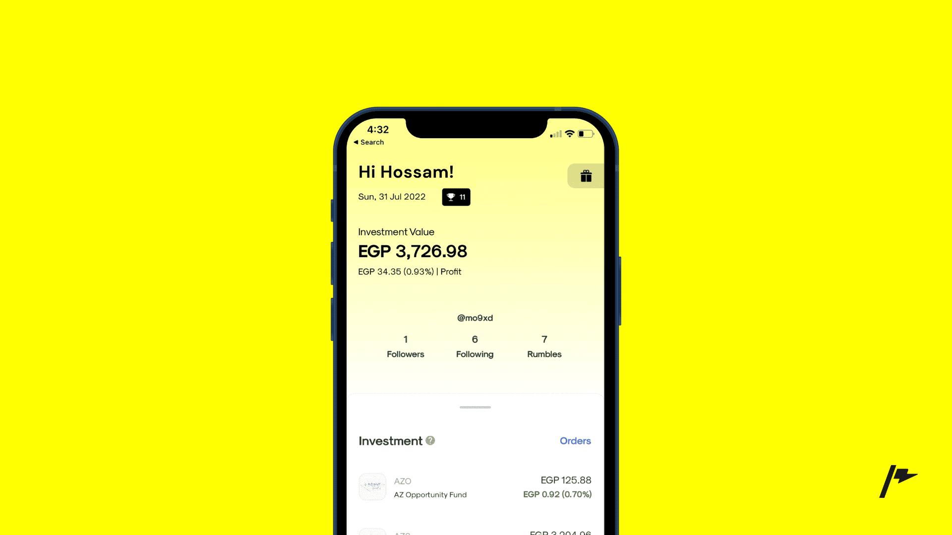
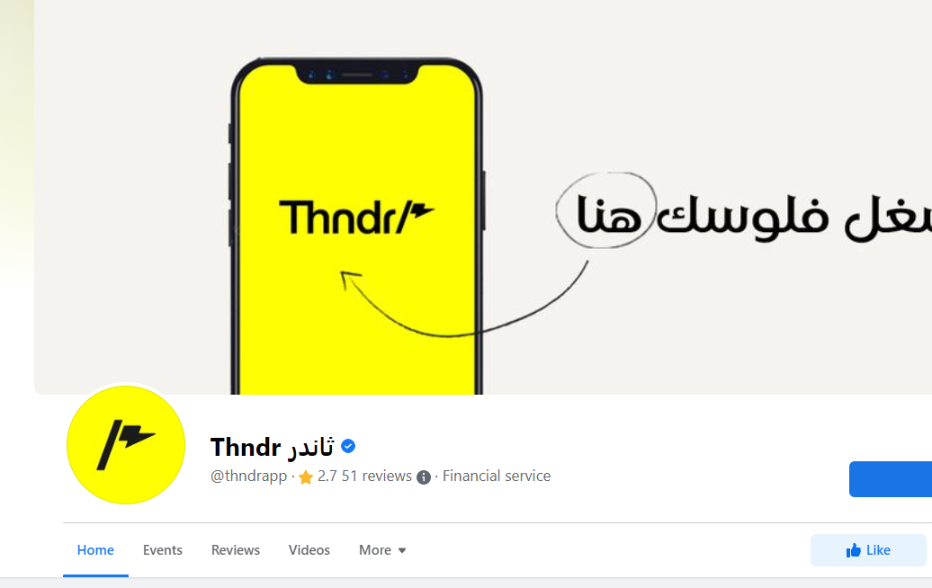
I knew about Thndr from facebook ads. I checked their website, and I found that they are licensed, established in Dubai & Cairo, got over $20M in funding, authorized and regulated by the Financial Regulatory Authority.
All sounds good, I think I can trust these guys.

So, I downloaded the app and the journey bagan. Yeah! You will see.
Right after downloading the app, I went to open the app to create my account. I was excited/anxious/happy/impatient to start trading.

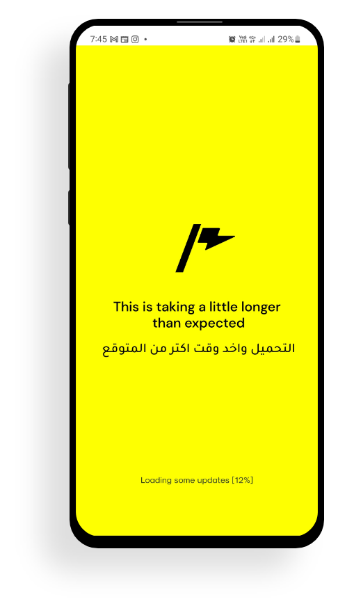
I kept waiting and waiting for the app to load, but it took a lot of time. I started wondering if my internet connection was working.
The good thing though is that the app showed a percentage for the loading status, which is great in this case to assure me that at least there is progress happening.
🚩
The ideal loading time for a mobile app is about two seconds. Thndr took 48 seconds to load, 24x slower than the ideal time. Given that studies show that a 1-second delay on your page load can cause a 7% reduction in conversions, that's something to work on and reduce this loading time ASAP. (Reference)
🚩
When adding a loading screen for time-consuming actions it's better to keep the user in the loop. This helps in building trust with the user and it also helps in reducing the feeling of a long wait for the user.
Thndr could enhance their loading screen by changing the title from downloading some updates to telling the user what is happening. Try this:
- Connecting to Thndr servers.
- Grabbing a list of stocks.
- Updating stock prices.
and for returning users
- Refreshing your wallet balance.
- Calculating your profits.
Also for the main title on the page, instead of showing a message that tells the users that the loading is taking longer than expected, how about you present some useful investment tips, something that could make waiting worth it.
Nice introduction to Thndr.
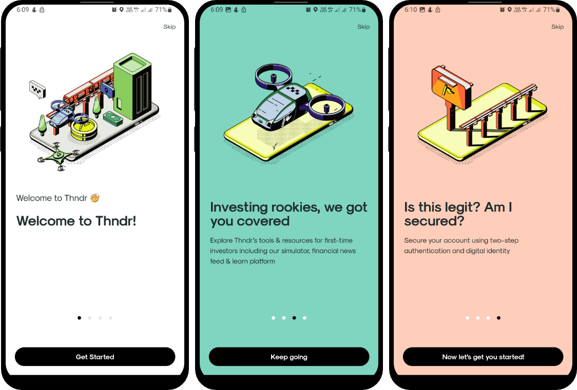
🙌
As a newcomer, I am anxious about this whole trading thing. Introducing the value of stock trading and using Thndr is a good way to soothe me and keep me motivated to reach my goal. I am not sure though if the value presented in the screens above are the best. I would recommend doing some interviews with targeted users, understanding their pain points for getting into stock trading, and trying to articulate the value presented on those screens to match these users' pain points and fears.
Okay, so here is the registration page, I can now enter my email and start an account.
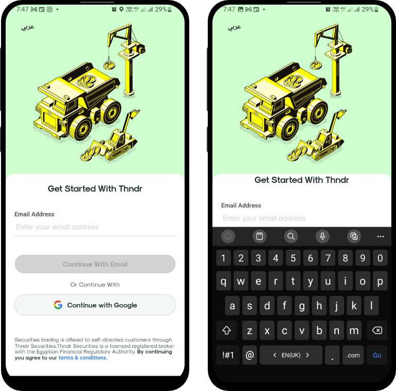
I usually use Google, but for this I decided to register using my email. OMG! I am so random 🤭

Okay, this is serious now, I have to very carefully type my email address in this tiny space, and move the keyboard down to see the button.
🧠
Cognitive load is the total amount of mental effort that is required to complete a task. The more elements the user has to scan in one page the more it adds to their cognitive load. Especially when designing for mobile devices our user's attention span is short and so we need to keep the design as clean & direct to the task as possible.
Removing the illustration at the top of the page, and keeping the focus on the task at hand will enhance Thndr's registration page.
Reference: Minimize cognitive load to maximize usability.
You can see in the examples1 below how they minimized cognitive load by removing all clutter and minimizing the design by reducing all elements in the screen to serve only one task.
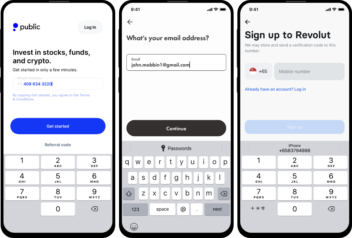
1 Screenshots from Public, WealthSimple & Revolut.
🧠💡
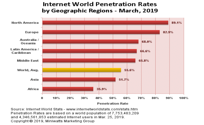
Users have an innate desire for things they're already familiar with. While email penetration in Egypt is around 60%, mobile connection is over 90%. Also, from my user research in other projects, most users prefer to use phone numbers over email addresses to login, especially from mobile devices.
If Thndr switches its login method from email address to phone number, it will help them reach a wider customer base.
Source: Digital 2022: Egypt — DataReportal – Global Digital Insights
Reference: Familiarty bias on growth.design .
I was asked to enter a verification code, I went to my email, got the code and went back to the app to write it.
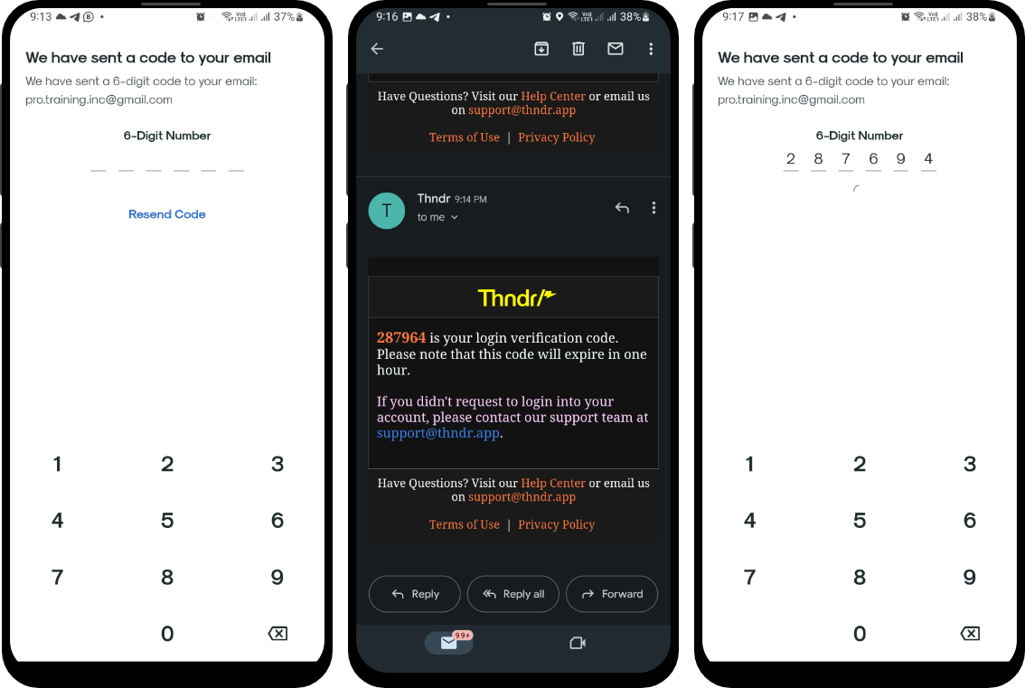
I like this page, clean and simple and it only has what I need. I type in my information and hit it.
✍️
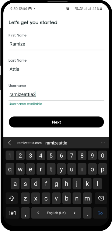
It's better to use a title that directly makes it clear what is required from the user in that step. A title like "Enter your personal information", is more clear than "Let's get you started".
As expected, the app asked me to set a 4-digit pin for login. I like the idea of 4-digit pin login for wallets and fintech apps because it matches my mental model of ATM cards, plus it's easy to remember.
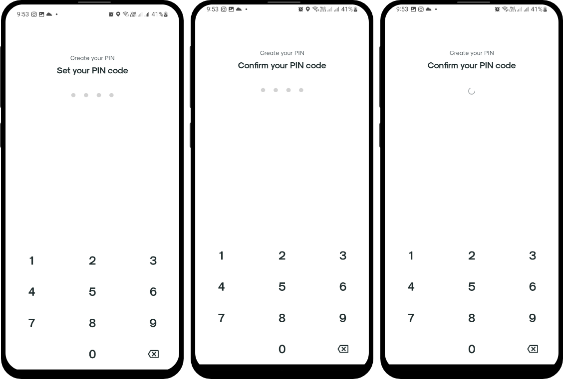
Cool! I like that once I enter the 4 digits it automatically submits the PIN and also the designs look super clean. They rock it 🤟!
👏👏
I like the registration process for Thndr so far, despite the notes above, the app really did a good job at creating a seamless registration process.
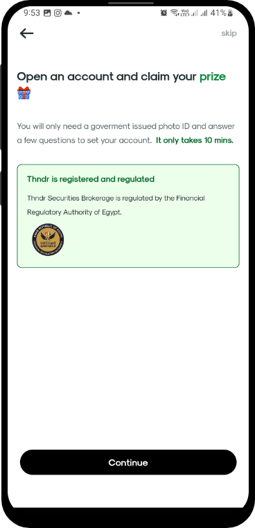
I don't understand why am I asked to open an account, I thought I already opened an account. Also, what prize am I getting?
👏
I like that Thndr included the fact that they are registered and regulated, which helps build trust in my relationship with them. But it would be better if they include some kind of reference. Something like a link that takes me to the registration details.
I thought I opened an account and was ready to trade stocks. Now I am asked to open an account and claim my prize. That was really disappointing and far away from my goal and the reason I am here.
Wait, what happens if I skip this step?
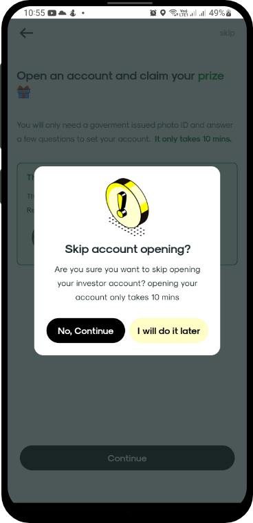
Well, even the skip message didn't help. I still don't understand the task, what account am I opening? What happens if I don't open the account?

I am so confused, but I guess this is the only thing I have to do right now, so I am gonna do it and see what happens.
🧠
The way you present information affects how users interpret and decide (framing effect).
Thndr can enhance that page by introducing users to their actual goal, and by understanding their user jobs first, which in my case is actually buying a stock. Getting a prize may encourage some users, but nothing is more encouraging to users than reaching the goal they are here for. So it's better that Thndr ties that gift to trading "maybe they will offer me a free stock or balance" if so they should make that clear in the design. 1Reference (framing effect in UX)
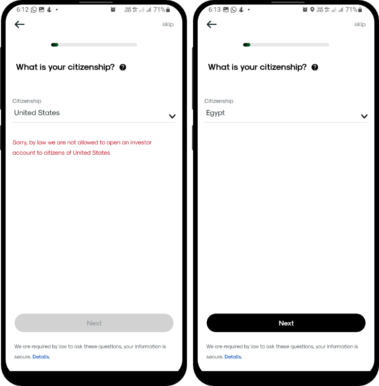
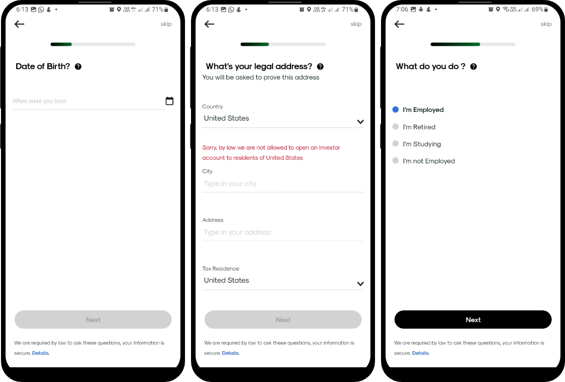
Okay, clearly opening an account was more about collecting more information.
But, woah! Why my Citizenship is United States? Also, I started with an error already.
Okay, Let me change the Citizenship.
🧠
Always try to help the user whenever possible by offloading tasks. It's easy for the app to auto-populate my country based on the GPS location or other ways. This will minimize the user cognitive load and enhance usability, plus they will avoid showing errors to users for no obvious reason.
Reference: Minimize cognitive load to maximize usability.
🧠
Again with offloading tasks. Even if the app cannot read my location, if I choose my nationality to be Egyptian, more times than not I will be living in Egypt so it will be easier to automatically populate the country field to be Egypt. OR just leave it empty.
Reference: Minimize cognitive load to maximize usability.
After entering all required information, I am now ready to start trading.

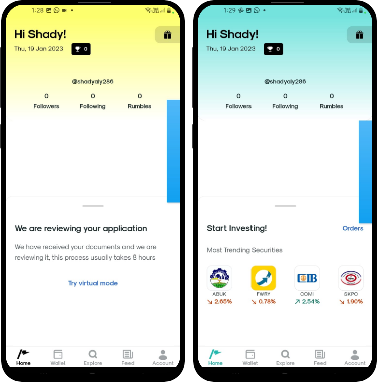
The app took me to the homepage, oh wait! I cannot trade yet.
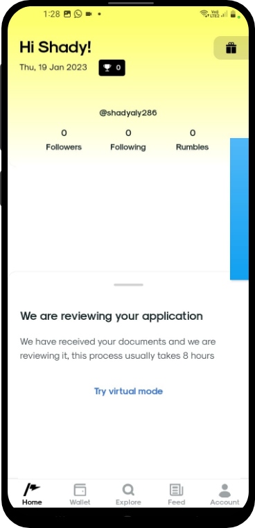
Guess I will have to wait for approval now.
🧠
Thndr has a virtual mode, an amazing feature that helps newcomers to experience trading in a safe zone. But the way the virtual mode is presented doesn't show its meaning, or value or give it the priority it deserves. While the user is waiting, Thunder can give the virtual mode priority.
Plus, considering that there is nothing I have to do now except for waiting, all elements currently shown on the homepage are useless and if removed will not affect my experience.
Something like a popup that shows up with virtual mode benefits, giving the user the option to play around with a virtual 100K pounds and learn until the review process is complete will help Thndr grow their users, build trust with newcomers, allow them to trust trading and build familiarity with the app.
Reference: Minimize cognitive load to maximize usability.
Again, there is nothing I can do here.
Switching to virtual mode was easy, with one click, but didn't present any value. If I don't understand virtual mode already I won't have any idea what it does, what happened to the app?, and how do I opt-out?
🧠
We hate losing or letting go of what we have (even if more could be had). When Thndr introduces a new feature that will switch the whole app, they should make sure to introduce the value behind it and a clear path out in case I don't like it. These two were completely missing.
Try to softly introduce virtual mode for users while waiting for approval, and add a clear option to opt out from virtual mode back to reality.
Exit points are meant to respect people's time. It was nice to use the background color to differentiate between virtual and normal mode, but switching back from virtual mode should be clear to the user.
Reference: Provide Exit Points
Reference: Prospect Theory and Loss Aversion: How Users Make Decisions.
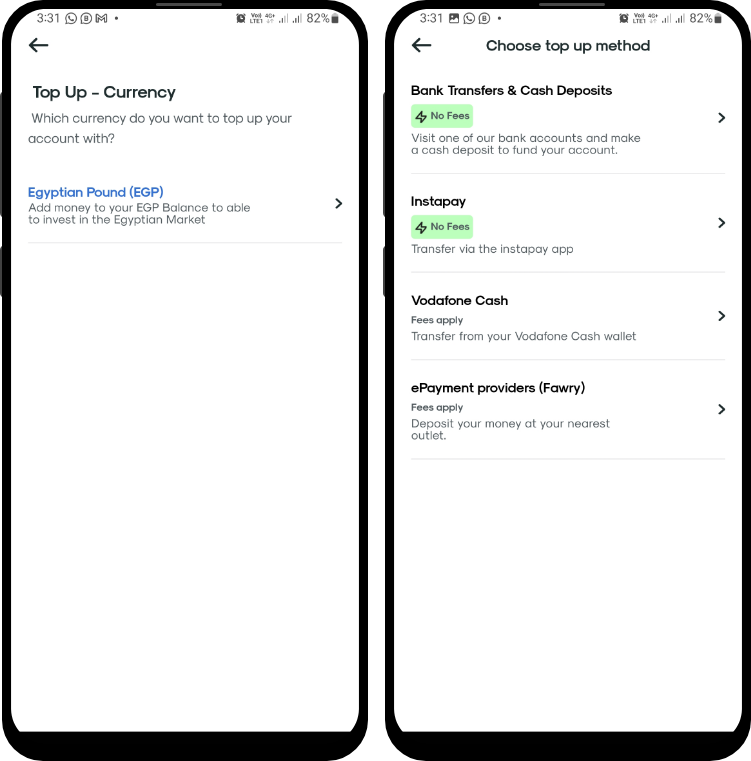
I already know I will send money through my bank account, so I going for Bank Transfer & Cash Deposits option. I wonder though, if EGP is the only option, why do I have to select it? 🤔
Nice, all options are clear and direct. I also like that they notify me that banks waived their fees, because it has a direct impact on my decision.
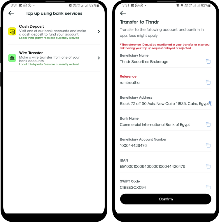
Nice, all options are clear and direct. I also like that they notify me that banks waived their fees because it has a direct impact on my decision.
Bank wire transfers take time, that's understood, but after two weeks, which is too long, I only got my transaction rejected without any explanation or contact from Thndr. What?!

AH GREAT! A robot. This is urgent I need to know where did my money go. After some trials, I finally got to leave a message and wait for a real person to get back to me.
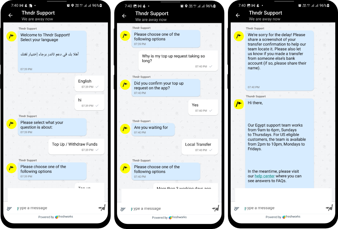
I had to wait for 5 more days for the support team to get back to me. In the end, Thndr did update my wallet after sending a screenshot of my transaction. I get it that such manual requests will overwhelm the support team and cause delays, but if that is the case, why didn't they just allow me the option to upload a screenshot of the transaction directly through the app when my transaction was rejected? It would have saved the support team from being overwhelmed and it would have saved me from the anxiety I had for a week.
Depositing money to Thndr was a real trust test, designing that process in a way that causes even the slightest confusion will cause the user to question the reliability of the product. If this happens when I am depositing money what will happen when I try to withdraw it? if I cannot reach the support right away who will I reach in case of emergency? We are talking money and stocks here guys!
🧠
The Halo Effect says that any one element in a user's experience with a company will rub off on their interpretation of other elements and their feelings about the company as a whole.
Your product must allow users to reach their goals easily without confusion, but while some mistakes can be forgiven others won't. Confusion in some vital parts could irreversably destroy your user's trust.
Thndr needs to change its money deposit process making it clear to users and giving them the tools they need to appeal any rejection in transactions without them having to do the hassle of reaching the support team. Giving deposits "especially first deposits" extra priority in support will also help Thndr enhance its deposit experience. Automating the process will also help reduce the load on the support team which will make reaching support more reliable.
Reference: The Halo Effect in UX Design.
While I was waiting for money to be deposited, I was worried and went to search Thndr online again. This time, I was looking for reviews and comments, I know, too late, but it is what it is.
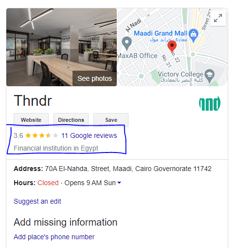

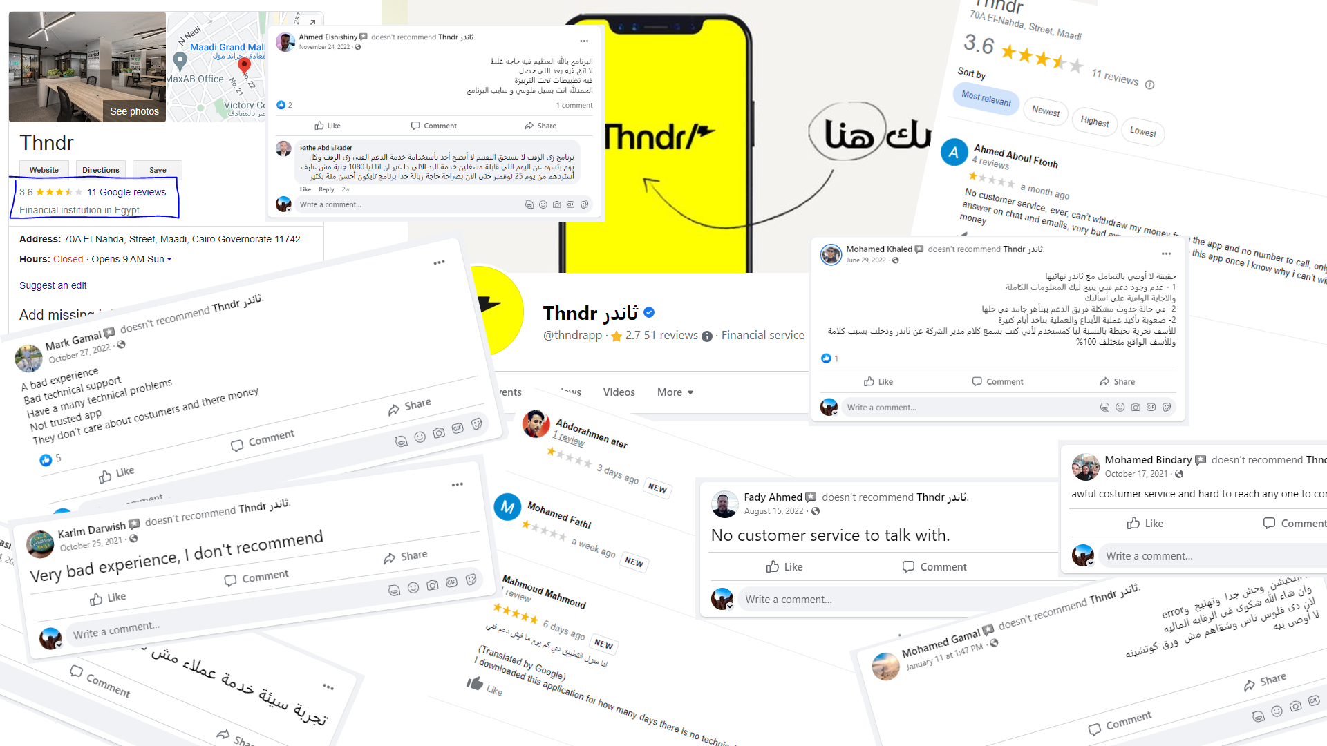
Bad reviews were everywhere on social media and good. All comments were related to bad experience regarding depositing money and reaching support.
🚩
Usually, users are reluctant to pull out of something they're invested in. Thndr is a startup and were expanding fast in the past two years, it makes sense that their support could be overwhelmed, but if Thndr can only get onboarding right, just to get users in the app and be invested in it, they will start tolerating some delays here and there, but if such issues exist while onboarding the app, it will be easier for users to pull out and just forget about it.
Reference: Prospect Theory and Loss Aversion: How Users Make Decisions
Reference: The psychology of sunk cost.
In the end, the money was deposited, but I was really considering withdrawing the money back and just forgetting about the whole thing. I delayed my decision for a few days to buy stock, but I decided to go on and give them a try.

Well, when I tried to buy stock, it was failing giving me an error that I cannot buy stocks.
Thndr! what did you do?

One more time, I had to call support. I navigated through the automated responses and finally sent my messages and waited for the support team to get back to me. After 4 days, I got a response that my contract is being prepared and that they will send it to me once it was ready.
After receiving the email, I went to the app, then to the stock I want to buy.
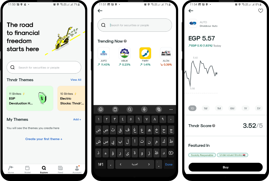
The data shown about the stock is basic, but since I am a newbie, I can see enough data about the stock. One thing I think could have helped me here though is seeing if others are buying the stock and if they are profiting from it.
🧠
Social proof is a convenient shortcut that users take to determine how to behave. When they are unsure or when the situation is ambiguous, they are most likely to look at and accept the actions of others as correct. The greater the number of people, the more appropriate the action seems.
Showing information like who is buying the stock, the trend of profits for others who bought the stock, or how long on average users keep that stock would have helped me in my decision in buying or not buy the stock easier.
Also, put in mind that we are social creatures, and feeling like we are part of a tribe builds our personality. If Thndr can build on that concept they will be able to form a habit for their users while using the app.
Reference: Influence: The Psychology of Persuasion Book
I went on with buying the stock, click on buy, set the number of stocks I want, and confirmed the order.
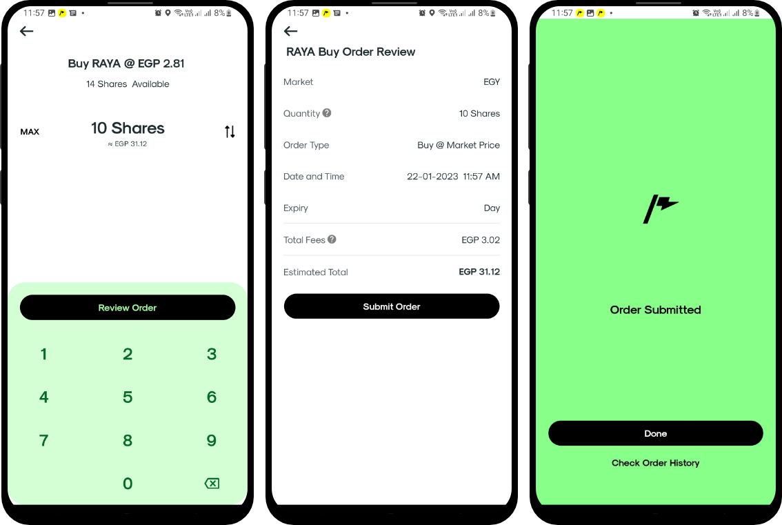
I like the process, it's easy and direct. One thing though, once I submitted the order I got the order submitted page, while that is good and communicated with the user that they reached their goal, there is a very good opportunity for Thndr here to hook me into the app and encourage my behavior of buying stocks.
🧠
There is an interesting study by Harvard Business School on the labor illusion. People value things more when they see the work behind them. Making users wait for something they requested while showing them how it is being prepared creates the appearance of effort. Customers are usually more likely to appreciate the results of that effort.
Tasks like buying a stock, especially my very first stock should be celebrated and valued by the app. There are two things that Thndr can make here to enhance the experience.
1) A buying stock screen (labor screen), this is a screen that should show me some work is being done for buying that stock. How about saying that the transaction is being made, logging you into the Egyptian stock market, changing stock ownership, updating your wallet, and then a confirmation of success? This will get users more invested in the app and value the decision they took.reference1
2) Celebrating your user's success. Overcoming the fear of buying stocks is a success for both Thndr and its customers. Not celebrating that success is a crime. Thndr can easily mitigate users' negative emotions, boost their positive emotions about buying stocks, and validate and celebrate their behavior which will eventually turn this into a habit. Never forget that the most successful products in the world help us build a habit around them.reference2
Reference2: Hooked: How to Build Habit-Forming Products
Reference1: The Labor Illusion: How Operational Transparency Increases Perceived Value.
After using the app for two weeks, I opened the app one day because I wanted to sell a specific stock because the price was dropping.
When I opened the app, it said I am logging in from a different device and asked me to regain access.
The app asked me to take a selfie with my ID, which I did. But then again, they have to manually review it.
That action locked me out of using Thndr for 3 days. I lost money because I couldn't sell the stock at the right time.
There was no one to reach because support was a robot. All I saw for three days was this screen.
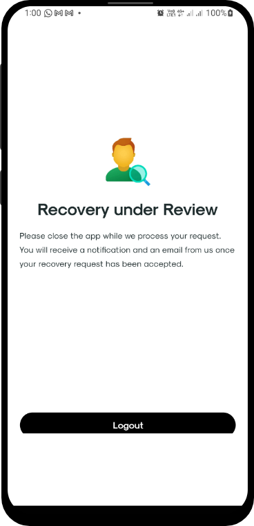
I came to the conclusion that I cannot trust Thndr with my investments yet, and from what I see, while there are some technical issues that led me to this decision, some tweaks to the user experience could have kept me in.
I am sure that I am not the only user Thndr has lost, and so in conclusion I wanted to list my case study here, maybe Thndr will see it helpful.
🧠
The Halo Effect says that any one element in a user's experience with a company will rub off on their interpretation of other elements and their feelings about the company as a whole.
Being unable to access my account when it comes to time-sensitive tasks like selling or buying stocks will destroy users' trust in the reliability of Thndr.
Both designers and developers in Thndr need to work together on finding a solution that allows them instant verification whenever needed and if possible eliminates the need for this verification as much as possible.
Just an example, instant OTP sent to their phone or email, biometric verification through fingerprint or voice recognition, or applying OCR to instantly verify selfies with IDs instead of manual verification. I am sure the team can come up with a dozen more ideas to come around this.
Reference: The Halo Effect in UX Design.
From my experience and from the comments and ratings of Thndr on Google and social media, it's clear they are losing customers, and the onboarding experience is one of the reasons. Fixes to the app design can boost their customer retention rate and increase their accessibility to a wider range of Egyptians. Below is a summary of how Thndr can enhance its onboarding experience for better conversion and retention rates.